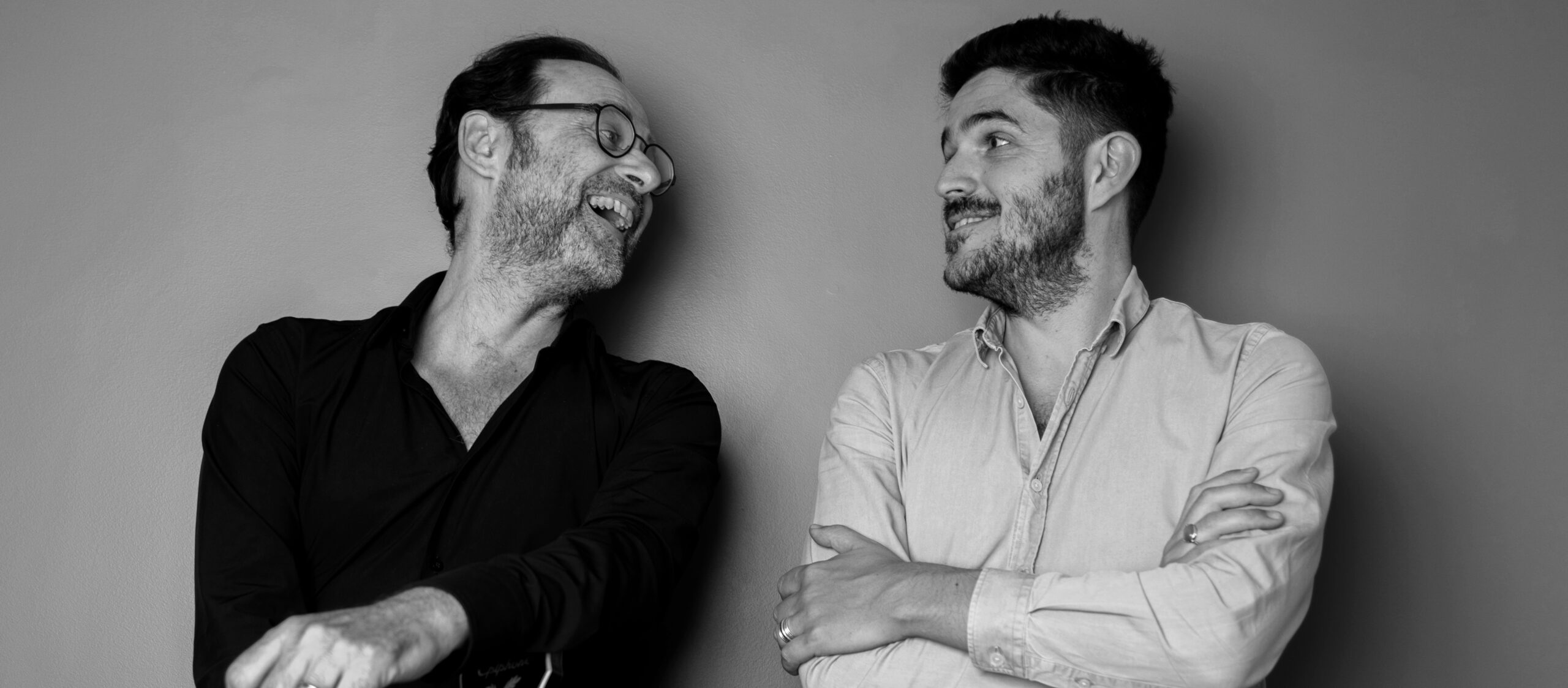
The angel and the pink are still here, though with a fresh twist. Sixième Son opens a new chapter in its history with a new identity that combines “Sense & Soul.” Insights from Michael Boumendil, Founder and President, and Laurent Cochini, Global Managing Director of Sixième Son.
What made this the ideal moment for Sixième Son to refresh its visual identity?
Michael Boumendil: 2025 will mark the 30th anniversary of Sixième Son and the realization of our greatest aspirations. It’s the year of unprecedented success: launching a record number of sonic identities across nearly 30 countries and industries ranging from luxury to technology, finance, and beyond.
This milestone reflects the extraordinary impact of our work. With over two decades of experience, we’ve refined our tools and strategies, empowering brands to boost awareness, captivate audiences, and foster deeper connections. In 2025, we’re amplifying this impact through cutting-edge AI integration, driving our mission to make brands preferred and unforgettable.
Creative excellence remains at the heart of our success, attracting the world’s best talents and ambitious brands. Next year, we’ll celebrate our 600th musical creation—proof of our relentless pursuit of innovation.
To mark this era of maturity, we unveil a new visual identity. Rooted in universality, simplicity, and the precision that defines us, it embodies the strength and artistry we bring to every project. This iconic symbol reflects our unwavering commitment to making brands truly legendary through sound and music.
What approach was taken to create the new visual identity, and what was it like experiencing the process as “the client” this time?
Laurent Cochini: Although we understand how challenging it can be to serve a client as an agency, I’m not sure we were an easy one! This agency holds immense meaning for us, making the stakes incredibly high.
But we fell in love with the manifesto. It gave us confidence—this concept of Sense & Soul became the foundation of everything that followed. I couldn’t have described Sixième Son better than the agency did in that manifesto. It felt obvious and natural because it was already part of our identity. All they needed to do was articulate it—and they did so beautifully.
Why did you decide not to change the Sixième Son name during this rebranding?
Laurent Cochini: Because of three significant things!
Our Team:
Half of our team is comprised of French members; the other half are internationals based in Paris and across our global offices. When we asked them about the name, they responded unanimously: they’re deeply attached. For many, Sixième Son represents the work of a lifetime—some have been with us for 5, 10, or even 15 years. The agency and our people evolve, but the name remains a constant, embodying their journey and dedication.
Our Clients:
Whether they’re in North America, the Middle East, Asia, or Europe, this name is distinctive to them. It’s often the first thing they want to discuss—whether it’s breaking the ice in an elevator during a meeting or within the first three minutes of a virtual call. This “small talk” becomes an opportunity to share the story of Sixième Son, a global leader with French roots. We are proud of our heritage and delighted to share the image of French craftsmanship, design, and even the “French touch” worldwide.
Our Agency:
Our team reminded us that our job is to create unique sounds for our clients. The name Sixième Son has a unique resonance, especially when pronounced by someone from another country. In France, it’s recognized as a genuine brand in design and music, making it essential for us to preserve its legacy.
Could you explain the importance of pink and the angel icon in Sixième Son’s DNA? Why were these elements chosen to remain in the visual language?
The pink and the angel have been with us since the agency’s inception and will remain with us for a long time. In the Renaissance, the angel is almost always depicted with a musical instrument. It’s a symbol born from art—a musical symbol of youth. Our angel is a musician but also a herald. This is what we are, too: the ones who invented the field of Sonic Branding. We are the voice of this craft; it’s our responsibility as leaders and pioneers in this profession.
Pink is our vision of audacity and creativity. Traditionally, music has been associated with carmine red—the color of opera curtains, a noble color but too bourgeois, too restrained for us. We chose a color that’s more provocative, more surprising, more creative, more lively, more vibrant, more tech-forward, and more identity-driven. A bright, bold pink—distinctive and iconic. Like what we create: distinctive and memorable sonic vocabulary.


